How srcset and picture choose the image your browser loads
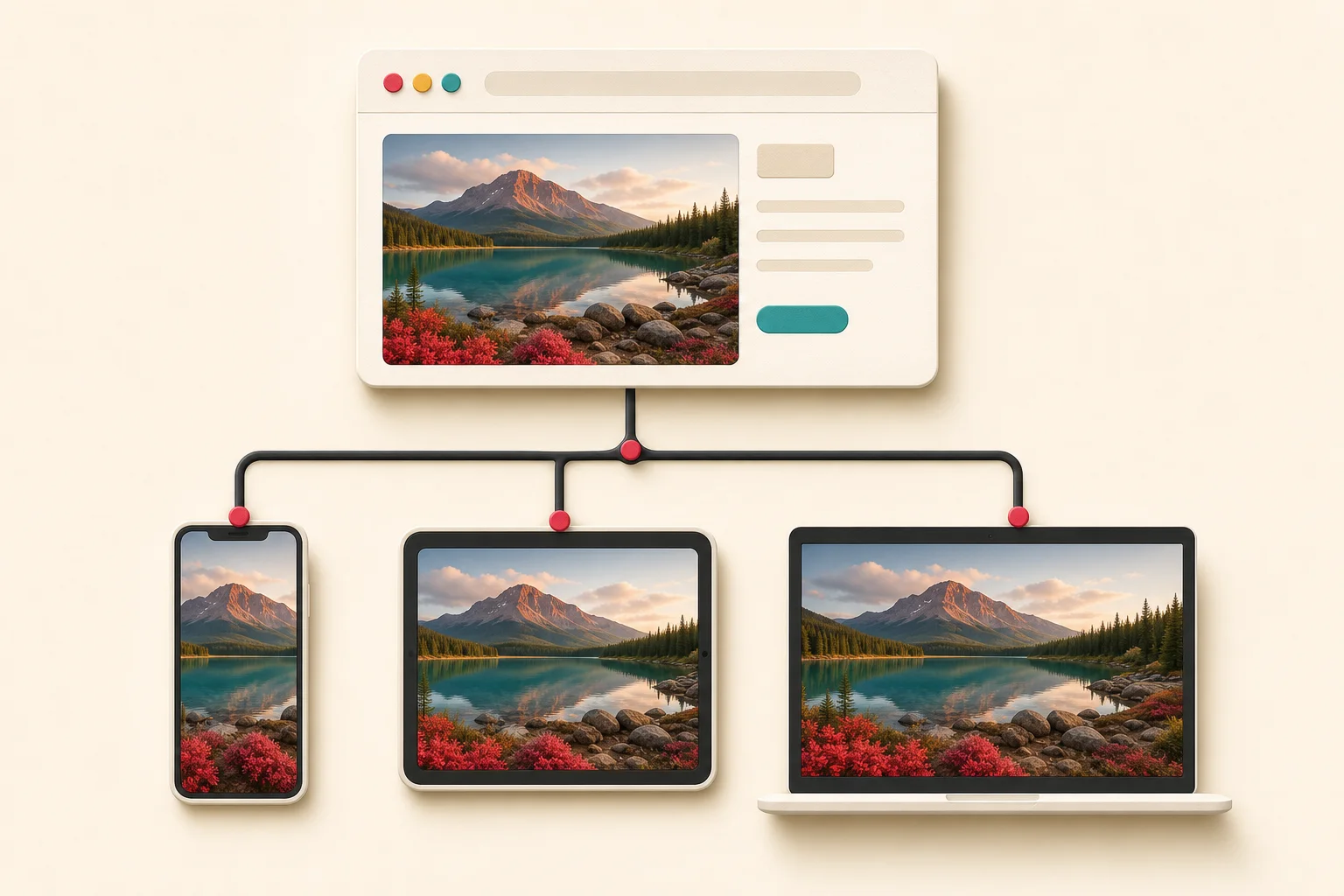
Open the same webpage on a phone and a desktop, and the photograph may look identical. Behind the scenes, the two devices can be downloading different files. The phone might receive a 640-pixel WebP while a high-density laptop receives a 1,600-pixel AVIF. That choice is usually controlled by srcset, sizes, and the <picture> element.
Responsive images are good for visitors. They stop a small screen from downloading a file several times larger than it needs. They can be confusing when you are backing up your own site, checking image quality, or trying to understand why an extractor returned several URLs for one picture.
The selection stops looking like browser magic once you read the markup. You can see which file loaded, which alternatives were available, and whether the page exposes a larger version.
Why one image has several files
Web publishers create image variants for two main reasons: resolution and presentation.
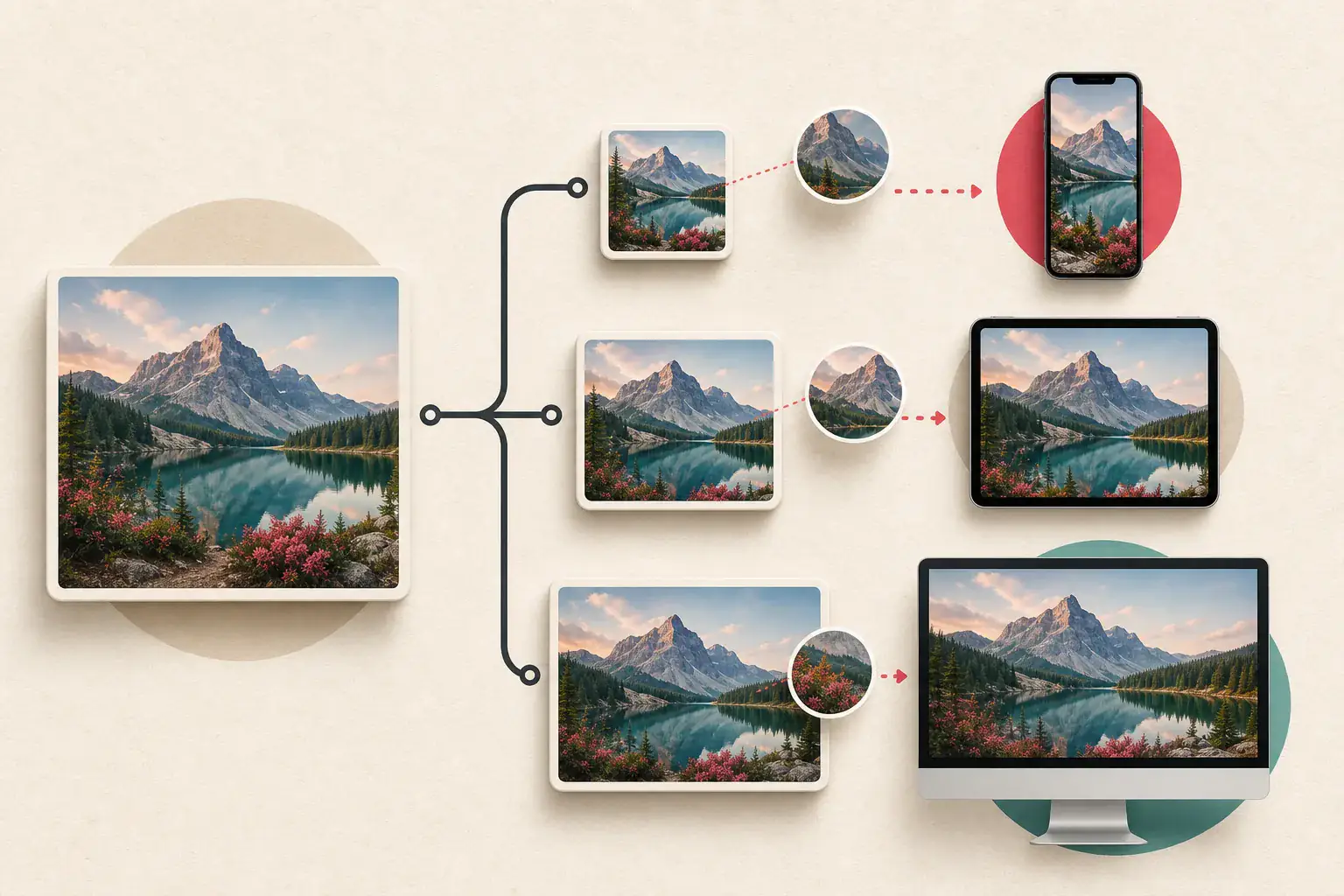
Resolution switching means the files show the same composition at different dimensions. A page may offer copies at 480, 960, 1,440, and 2,400 pixels wide. The browser chooses one that should look sharp without wasting too much bandwidth.
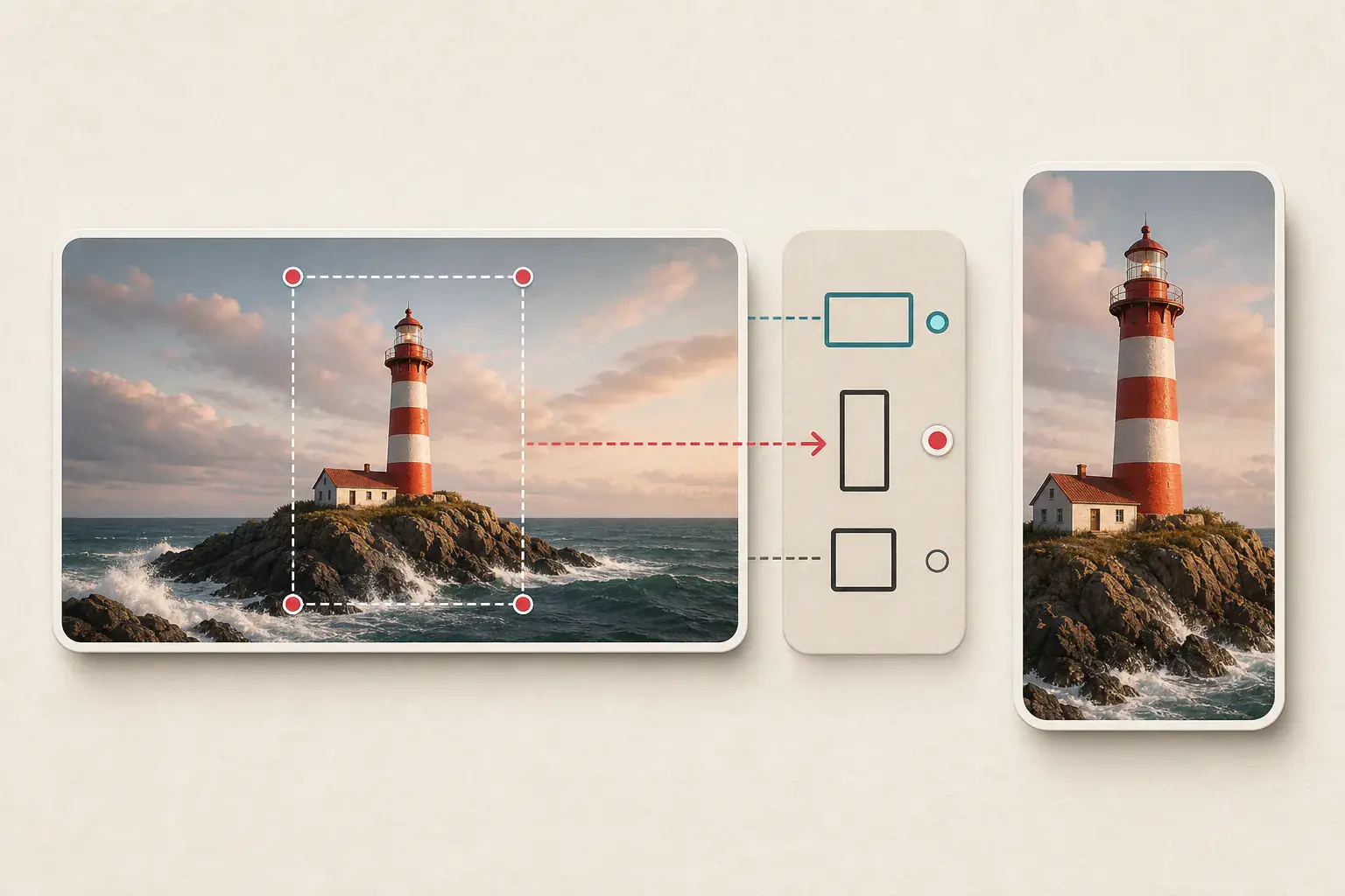
Art direction is different. The phone version may be a tight portrait crop while the desktop version is a wide landscape. The subject stays visible even though the composition changes. The <picture> element is commonly used for this.
Format negotiation is another use. A <picture> can offer AVIF and WebP to browsers that support them, with a JPG fallback for older software.
These mechanisms can overlap, so one visual slot may reference a dozen files.
The role of src
The familiar src attribute provides an image URL:
<img src="lake-800.jpg" alt="A lake below a mountain ridge">
Without responsive markup, every browser requests that file. CSS can make it look smaller, but the downloaded asset remains the same.
When srcset is present, src is still useful as a fallback and may be considered as a candidate. It is not safe to assume that src is the best or largest version. On a modern browser, a candidate from srcset will often be selected instead.
Reading width descriptors in srcset
A width-based srcset lists files and their intrinsic widths:
<img
  src="lake-800.jpg"
  srcset="lake-480.jpg 480w,
          lake-800.jpg 800w,
          lake-1280.jpg 1280w,
          lake-2000.jpg 2000w"
  sizes="(max-width: 700px) 92vw, 760px"
  alt="A lake below a mountain ridge"
>
The 480w label says the first file is 480 CSS pixels wide intrinsically. It does not instruct the browser to display it at 480 pixels. The sizes attribute estimates how wide the image will appear in the layout.
In this example, the image occupies about 92 percent of the viewport on screens up to 700 pixels. On larger screens, its layout width is 760 pixels. The browser combines that information with device pixel density and its own resource decisions.
A 390-pixel-wide phone might display the image around 359 CSS pixels wide. On a 2x screen, roughly 718 source pixels are useful, so the browser may select the 800-pixel candidate. A standard-density desktop displaying the slot at 760 pixels might choose that same file. A 2x desktop could choose 1,280 or 2,000.
The browser is allowed some discretion. Cache state, connection conditions, and implementation details can affect the final request. srcset describes candidates, not a promise that one exact file will always load.
Reading density descriptors
Density-based candidates use 1x, 2x, and sometimes 3x:
<img
  src="icon.png"
  srcset="icon.png 1x, icon@2x.png 2x, icon@3x.png 3x"
  alt="Application icon"
>
This approach is suited to images with a predictable display size, such as an avatar or small interface graphic. A 2x display generally receives the 2x file.
Do not mix width descriptors and density descriptors in the same srcset. They solve related problems with different information.
What sizes actually describes
The sizes attribute is often misunderstood. It describes the image's expected layout width, not the dimensions of the source files.
The browser evaluates the conditions from left to right and uses the first match. The final value acts as the default:
sizes="(max-width: 500px) 100vw,
       (max-width: 900px) 70vw,
       720px"
If sizes is inaccurate, the browser can choose a file that is unnecessarily large or too small. A page that says an image will be 100vw even though it occupies half the screen may waste bandwidth. A page that understates the slot may cause softness on high-density screens.
When diagnosing a blurry download, compare the declared sizes value with the image's actual rendered width. That mismatch may explain why a small candidate was selected.
How the picture element adds rules
The <picture> element wraps one or more <source> elements and one <img> fallback:
<picture>
  <source
    media="(max-width: 600px)"
    srcset="portrait-600.avif 1x, portrait-1200.avif 2x"
    type="image/avif"
  >
  <source
    srcset="wide-900.webp 900w, wide-1800.webp 1800w"
    type="image/webp"
  >
  <img src="wide-900.jpg" alt="Cyclist crossing a bridge">
</picture>
On a narrow screen with AVIF support, the browser can use the portrait crop. On a wider screen, it skips that media rule and considers the WebP source. A browser that cannot use either source falls back to the JPG in <img>.
Source order matters. The browser uses the first suitable source; it does not download every option and compare the pictures visually.
currentSrc tells you what actually loaded
Developer Tools can show the requested file, but the DOM also exposes it through the currentSrc property. Select an image element in the Elements panel and evaluate:
$0.currentSrc
To compare the selected file with the fallback and candidate list, inspect:
({
  current: $0.currentSrc,
  fallback: $0.src,
  candidates: $0.srcset,
  naturalWidth: $0.naturalWidth,
  naturalHeight: $0.naturalHeight
})
currentSrc is the answer to "what did this browser load right now?" It is not necessarily the original, the largest candidate, or the file another device will choose.
Why an extractor returns several versions
A basic scraper may collect only src. A rendered image extractor can see currentSrc, candidates in srcset, sources inside <picture>, lazy-loading attributes, and sometimes linked originals. Returning several URLs is therefore correct, even if the page shows one image.
The useful next step is grouping variants. Compare their base filename, dimensions, format, and CDN path. A 400-pixel crop and a 2,000-pixel wide original should not be treated as unrelated files, but they should not be assumed to have identical compositions either.
Use the ExtractPics image URL extractor when you need to review the addresses rather than immediately save every file. For noisy pages, the guide to filtering icons and tracking pixels helps clean the result.
How to find the largest appropriate candidate
Start with the markup the publisher provided.
- Inspect the
<img>and any parent<picture>. - Copy
currentSrcso you know what loaded. - Record every
srcsetcandidate and width descriptor. - Check whether different
<source>elements represent formats or different crops. - Preview the largest relevant candidate rather than choosing by filename alone.
- Look for a parent link or gallery action that exposes an original.
- Verify the file's actual dimensions after downloading.
The largest number is not automatically the best choice. A 1,600-pixel portrait crop may be less useful than a 1,200-pixel uncropped image. An AVIF may preserve excellent quality but be inconvenient for an older editing program. Choose based on your authorized task, not width alone.
If the large candidate still looks soft, read why extracted images look blurry. A CDN may be serving an upscaled or heavily compressed version.
Responsive images and lazy loading
Responsive selection and lazy loading are separate. srcset decides which candidate fits. Lazy loading delays the request until the image approaches the viewport.
An element can use both:
<img
  loading="lazy"
  src="gallery-640.webp"
  srcset="gallery-640.webp 640w, gallery-1280.webp 1280w"
  sizes="(max-width: 700px) 100vw, 700px"
  alt="Ceramic bowls on a shelf"
>
If a tool reads the raw HTML, it can see these URLs even before the browser requests one. Some sites instead store the candidates in data-srcset and move them into srcset with JavaScript. That is why a rendered scan can find more than a static request. The lazy-loaded image extraction guide covers those patterns.
A simple test page for your own site
When you build responsive markup, test it rather than trusting visual appearance.
- Resize the viewport across each breakpoint.
- Test standard and high-density displays when available.
- Inspect
currentSrcat every size. - Confirm that the rendered image is not wider than its useful source resolution.
- Check the Network panel for duplicate downloads.
- Disable cache during debugging so an earlier request does not confuse the result.
- Verify that every candidate has the same intended subject and accurate alt text.
MDN's Responsive images guide documents the standard behavior and examples. It is a better reference than copying an unexplained snippet from a theme.
Keep technical access separate from reuse rights
Responsive markup makes image URLs visible because the browser needs them. Visibility is not a license. Use the candidates for your own website work, authorized client projects, permitted backups, accessibility checks, and other lawful purposes.
When the image belongs to another publisher, confirm its license before republishing. The guide to checking an image's source and license provides a repeatable process.
Read the browser's choice in context
Think of srcset as the candidate list and sizes as the browser's estimate of the space available. <picture> can change the format or even the crop. currentSrc tells you which candidate won on the device in front of you.
That last detail matters during a backup. The file your laptop chose is sensible for that screen, but it may not be the best master. Read the whole candidate list, check the actual dimensions, and make sure alternate crops still show the subject you need. Several URLs for one photograph are normal here; they are the responsive system doing its job.
Related posts
Why extracted images look blurry and how to find the original
A practical guide to finding the full-resolution file when a website gives you a soft thumbnail, compressed preview, or undersized responsive image.
How to extract lazy-loaded images missing from page source
A tested workflow for revealing images that appear only after scrolling, clicking, or allowing JavaScript to render the page.
How image CDN URL parameters change size, crop, and quality
A technical field guide to reading transformed image URLs and finding the largest version a page is authorized to serve.